

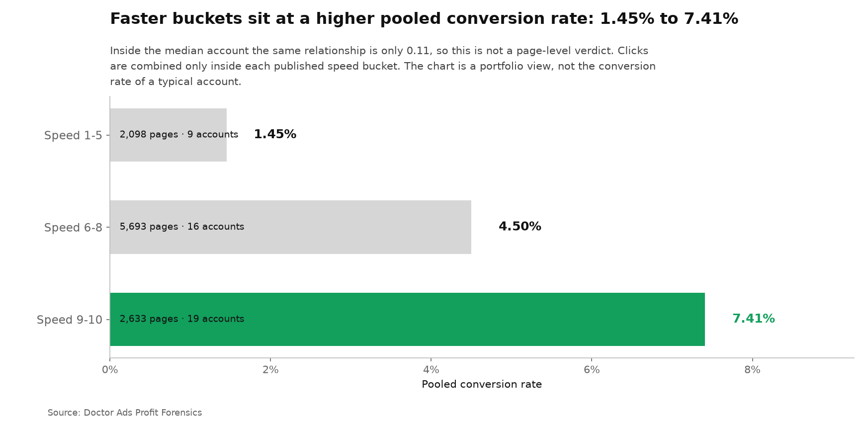
TL;DR abstract. Your fastest-looking landing pages can still send you chasing the wrong fix. Google's mobile speed score is its one-to-ten reading of page speed and expected conversion potential. In the portfolio view, the top bucket converted clicks at 7.41%, which looks decisive. The slow bucket sat at 1.45%, making the contrast fivefold.
Yet inside individual accounts, the median relationship between speed rank and conversion rank was only 0.11, with the middle half of accounts from -0.06 to 0.21. That makes speed a promising place to investigate, not a page-level verdict. Each account contributes one export window, and those windows are not aligned: most run from September 2024 into January 2025, some accounts exported an all-time view, and a few extend into early 2026. Within that material we could test three native Google Ads ratings against outcomes: mobile speed, Optimization Score and Ad Strength. Quality Score was not tested: its columns were missing from our exports for all but one of the accounts, a gap in our collection rather than a platform failure, and the one export that carries them appears below only as a single-account observation. The population is a self-selected managed portfolio, not a random sample, and the strongest speed contrast is pooled while the account-level relationship is weak.
Three scores were testable, and each one answered a narrower question than its promise
A green dashboard invites one reflex: start with the lowest score and work upward. Our tests suggest a narrower use. A native score can identify a floor, a missing input or a place worth opening. It does not automatically tell you which campaign, ad or page will return the most money.
The three tested scales reached that conclusion by different routes. Mobile speed showed a dramatic portfolio contrast but only a weak relationship inside the median account. Ad Strength separated weaker ads in our paired test, then stopped separating its top two labels, which is where the Adalysis result already sat. Optimization Score barely ordered campaign outcomes and was packed near the top of its own range.
| Native score | What we could test | Measured result | Owner verdict |
|---|---|---|---|
| Mobile speed | Page score against conversion rate | 7.41% versus 1.45% pooled, but median within-account rank relationship 0.11 | Open the pages, then verify the pattern inside your account |
| Ad Strength | Paired replication of Adalysis 2022 inside one ad group | Good beat Average on click rate in 71.1% of 807 groups, but Excellent beat Good in only 48.3% of 1,613, an exploratory pair we did not pre-register | Fix weak ads; stop polishing the final label |
| Optimization Score | Campaign score against campaign outcomes inside one account | Median rank relationship 0.05 for click rate and -0.05 for conversion rate | Use as a configuration prompt, not a money ranking |
| Quality Score | Not measured across the portfolio | Its block existed in only one account export | Do not infer a portfolio result from one account |
The cross-score ceiling pattern is exploratory. Each underlying measurement was registered separately, but the common shape appeared only after the results were placed beside each other.
The practical rule is simple: a platform score earns the right to open a case, not to close it. Once the case is open, rank the underlying items by the outcome the business pays for.
The portfolio speed gap is fivefold, but the account-level link is 0.11
The headline view is hard to ignore. Pages scoring 9 or 10 converted pooled clicks at 7.41%, while pages scoring 5 or below converted at 1.45%. Those buckets contain 2,633 and 2,098 pages. The high bucket looks like an obvious priority.
But here is the twist. Count each account once and the contrast becomes 3.52% versus 1.82% for the median account in each bucket. The direction remains useful, but the size shrinks sharply.
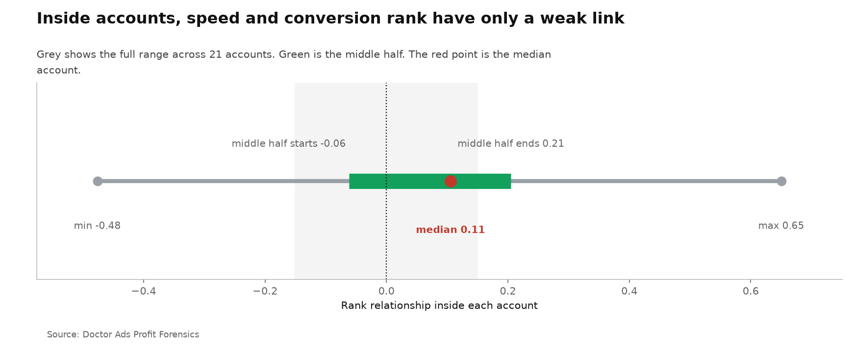
More important, the median relationship between a page's speed rank and its conversion rank inside one account is 0.11. The middle half runs from -0.06 to 0.21, and individual accounts range from -0.48 to 0.65. Some accounts lean the other way.
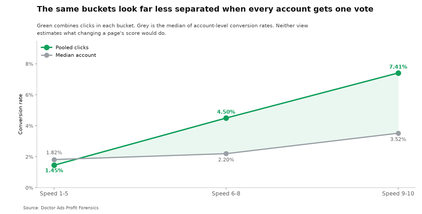
That is the decision. Do not carry the 7.41% portfolio rate into a forecast for one page. Use the column to find a test candidate, then calculate the page-level pattern inside your own account before funding a rebuild.
If your account needs this kind of inside-account ranking across campaigns, ads and pages, a Profit Forensics examination is built around that question. The output is a work queue ranked by the account's own money after the platform summaries are removed.
Google's speed promise survives only as a place to investigate
Google's landing-page guidance presents speed as one of the easiest routes to better mobile results. The original Mobile Speed Score launch described the score as a reflection of real user experience and potential conversion rates. Our portfolio result points in the same direction. Our account result limits how literally an owner should read it.
The clean mental model is triage. A hospital temperature reading is useful because it tells you where to look, not because it names the disease. Mobile speed works the same way here.
A low score is an invitation to inspect load time, page stability and the path to the conversion. A high score does not certify the offer, message or form.
This distinction also explains why the public evidence did not answer our question. Google has modeled behavior across millions of advertising landing pages. Brainlabs ran a one-account page-speed experiment with Quality Score as its outcome.
We found no prior independent multi-account test of the Google Ads speed column itself against conversion rate. The gap was not whether slow pages can be unpleasant. It was whether this specific score orders pages inside a working account. In the median account, it barely does.
The pooled conversion rate peaks at nine, then falls at ten
The ten-step scale creates a natural expectation: each step should represent a cleaner place to stand than the step below it. The observed pooled rates do not follow that order. Pages scoring 9 converted at 9.09%, while pages scoring 10 converted at 4.76%. The comparison covers 1,477 and 1,156 pages.
This is an exploratory comparison, added after the registered bucket test. It is also pooled. The accounts contributing to score 9 are not the same set as those contributing to score 10, so the chart does not show what would happen if a page moved from one score to the other. Its value is diagnostic: the top label is not a safe shortcut to the top conversion rate.
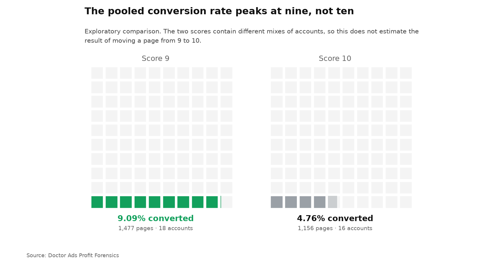
The lift is practical. Treat 10 as a cleared technical threshold. Do not treat it as permission to stop looking at the page's conversion path.
Ad Strength separates weaker ads, then stalls between Good and Excellent
Ad Strength is the four-label feedback scale attached to a responsive search ad. It grades the assets supplied to the system, while Google's own documentation says the label is not used to calculate auction wins.
Adalysis established the core pattern in 2022 using more than one million ads and the same paired design inside an ad group. Our previous study is a replication and a split by step, not a claim of discovery.
Good beat Average on click rate in 71.1% of 807 matched groups. Excellent beat Poor in 67.9% of 224 groups. Every rung below the top carries information.
At the top, that information disappears. Excellent beat Good in 48.3% of 1,613 groups. That final pair was exploratory in our earlier study.
The action is still clear: repair Poor and Average ads. Once the ad reaches Good, let its observed clicks and conversions decide whether another asset rewrite deserves time.
The full paired analysis, including the Adalysis replication and the weighting disagreement, is in our Ad Strength study. The detail stays there so this rollup does not pretend to be a new test.
Optimization Score was compressed near the top and did not order outcomes
We did not rerun this measurement. Our previous Optimization Score analysis found a median rank relationship of 0.05 with click rate and -0.05 with conversion rate. Those readings did not create a reusable campaign order.
The one rollup detail that matters here is the ceiling: half of scored campaigns sat inside a 23-point band from 74.6% to 97.1%. A compressed scale has little room left to distinguish campaigns. Google's documentation also shows that the score moves when recommendations are applied or dismissed, which makes it a configuration prompt rather than a direct outcome reading. The full context, including the separate cross-account evidence from Optmyzr, stays in the source article.
Quality Score was absent from all but one account export
Quality Score is the one result we did not obtain. The block containing its columns was present in exactly one account export with keyword data. In the others, the entire block was absent. We did not collect those columns, so we did not observe how Google behaved there.
That one export carries 50,011 keyword rows, every one of them inside the score block, and 8,381 of them show a dash instead of a number, or 16.8%. That count comes from the sibling text columns of the same block, which store the dash as written rather than converting it to a number, so an unscored keyword can be told apart from a column that was never exported. That is an observation about one account only. It cannot support a claim that Google often declines to score keywords, and it cannot support a claim that Quality Score works or fails across a portfolio.
This matters because Google calls Quality Score a diagnostic tool, not a key performance indicator, while its broader ad-quality guidance connects higher quality with lower click costs. That tension is measurable. We simply did not collect the portfolio data needed to measure it here. The honest result is a collection gap with a known reason.
The three measured scales share an exploratory ceiling failure
Put the studies side by side and a post-hoc pattern appears. Mobile speed peaks at 9 and falls at 10 in the pooled view. The Adalysis pattern replicated in our Ad Strength sample separates lower labels but not Good from Excellent. Optimization Score packs half of its scored campaigns into a narrow band near the top.
We call this exploratory pattern The Ceiling Blind Spot. It was not registered before any of the three underlying studies, and the studies were designed independently. The name describes a question for replication, not a settled law: native scores may be most useful for clearing a floor and least useful for ordering items that already sit near the ceiling.
| Scale | What happens near the ceiling | Status |
|---|---|---|
| Mobile speed | Pooled conversion rate is 9.09% at score 9 and 4.76% at score 10 | Exploratory, pooled, different account mix |
| Ad Strength | Excellent beats Good in 48.3% of 1,613 paired groups | Exploratory pair, replication of the broader Adalysis pattern |
| Optimization Score | Half of campaigns sit between 74.6% and 97.1% | Observed compression, interpretation exploratory |
The owner advantage is not another rule to obey. It is permission to stop polishing a score after the floor is cleared and move attention back to the offer, the search terms and the cost of the conversion.
Use native scores as filters, then rank the money inside your account
The replacement workflow has two passes. First, use native ratings to find broken floors: a slow page, a weak ad, a recommendation that reveals a missing setting. Second, rank the candidates by the account's own outcomes. A score opens the queue; money sets its order.
For pages, compare conversion rate inside the same account and reporting window. For ads, compare variants inside the same ad group. For campaigns, rank spend with no conversions, cost per conversion against the account's own baseline and auction loss attributed to rank rather than budget. Those comparisons hold the surrounding economics still long enough for a decision.
The aphorism is worth keeping: clear the score's floor, then leave its ceiling alone. That is the practical meaning of The Ceiling Blind Spot, pending a direct replication built to test it.
The researcher's take
I would not ignore these scores; I would demote them. A low rating often points to unfinished work, and unfinished work deserves a look. What I would stop doing is treating the final green label as a ranking of profit, because the most interesting score here produced a fivefold portfolio contrast and a weak account-level relationship at the same time. That is why your own account must be the courtroom: the platform can point to the case, but your money delivers the verdict.
Igor Ivitskiy, PhD
Method and data statement
Doctor Ads Profit Forensics is the research desk of a Google Ads practice with 19 years and $770M managed spend behind it.
Data statement, corpus version 2026.07. We selected one physical export and one reporting window per account, choosing the snapshot with the most spend; selected snapshots carry $113.16M. The speed funnel began with 10,746 numeric pages, retained 10,731 pages after the minimum of 20 pages per account, and used 10,424 pages across 22 accounts where conversion data were complete, carrying $40.09M. Account-level conversion rates were always calculated inside each account and were never presented as a cross-account average; the 7.41% and 1.45% headline contrast is the explicitly labeled pooled bucket view. The companion account result is a median rank relationship of 0.11, middle half -0.06 to 0.21, n=21. Equal-account medians and spend-weighted means were both inspected: for the fast bucket the median account rate was 3.52% and the spend-weighted mean was 5.88%, while the speed relationship rounded to 0.11 under both views. The portfolio is managed, client-selected and skewed toward larger accounts. To reproduce the result, export page URL, mobile speed, clicks, cost and conversions for one window per account; keep only pages with at least 20 clicks and some cost, which is the filter used here; keep accounts with at least 20 scored pages that survive it; form the 1-5, 6-8 and 9-10 buckets; calculate each account's rates and speed-to-conversion rank relationship; then report account medians, middle-half ranges, sample sizes, the pooled bucket view and the spend-weighted view separately.
Limitations
- Observed pages, not assigned treatments. The pages already differed in offer, traffic and design. This study does not estimate the result of changing one page's speed.
- Managed and self-selected portfolio. Large accounts are overrepresented, so the sample does not mirror every Google Ads advertiser.
- Missing speed data. Pages enter the count only if they carry at least 20 clicks and some cost, which is also what an owner should export to repeat this. Within that filter, 17,183 pages carried no numeric speed score and 307 more lacked conversion data. The measured population is the remainder, not the full page corpus.
- One pooled headline. The fivefold contrast combines traffic inside speed buckets. It is published beside the much weaker account-level relationship so neither view impersonates the other.
- Exploratory ceiling pattern. The score-9 versus score-10 comparison uses different account mixes, and The Ceiling Blind Spot was named only after three separate studies were complete.
- Quality Score collection gap. Twenty-nine exports lacked the block entirely. The single available account is a case series and supports no portfolio generalization.
Key Takeaways
- Fast-bucket pages converted pooled clicks at 7.41% versus 1.45% in the slow bucket, while the same relationship inside the median account was only 0.11. Use that as a reason to investigate speed, not as a forecast for one page.
- The median within-account speed relationship was 0.11. The middle half from -0.06 to 0.21 says the local order is weak and sometimes absent.
- Ad Strength sorted the lower labels and stopped at the top. Good beat Average on click rate in 71.1% of matched groups, a pre-registered pair, while Excellent beat Good in only 48.3%, an exploratory pair that reproduces the Adalysis null at the ceiling.
- Optimization Score did not rank campaign outcomes. Median relationships were 0.05 for click rate and -0.05 for conversion rate.
- The Ceiling Blind Spot is exploratory. Clear weak scores, then let account outcomes rank the work.
When this does not apply
New accounts with no usable outcome history. When an account has too little conversion data to compare pages or campaigns, a native score can be a reasonable setup checklist because the money ranking does not exist yet. Treat it as a temporary prior and replace it when outcomes accumulate.
Single-page or single-ad decisions. If there is no alternative inside the same account, page set or ad group, the paired method in this study cannot rank anything. Use a controlled test or a direct technical diagnosis instead.
Accounts unlike this portfolio. A small, unmanaged or newly built account may have much more variation at the bottom of each scale. The ceiling pattern could weaken when basic setup problems dominate.
This analysis describes observed portfolio data and does not guarantee the result in another account.


