

The short version. Ad Strength is the four-step rating Google puts next to every responsive search ad: Poor, Average, Good, Excellent. Adalysis established in 2022, on more than a million ads, that comparing ads inside the same ad group makes the rating look like a coin flip: the higher-rated ad had the lower click-through rate 51.5% of the time. We repeated that test on 72,970 ads in the Doctor Ads Profit Forensics portfolio, and then did the thing their write-up did not: split the result by which step of the scale is being compared.
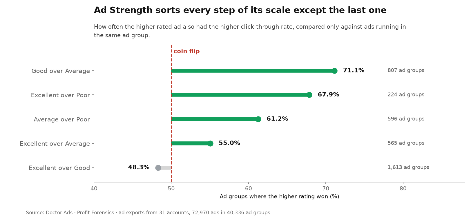
- Split that way, the rating works better than its reputation. Where the gap is a full step or more, the higher-rated ad wins clearly: “Good” beats “Average” in 71.1% of the ad groups running both, “Excellent” beats “Poor” in 67.9%, “Excellent” beats “Average” in 55.0%.
- One comparison is empty, and it is the one advertisers spend their time on: “Excellent” beats “Good” in 48.3% of 1,613 ad groups. Between the top two steps the rating carries nothing, and that number reproduces Adalysis almost exactly.
- That last comparison was not part of what we registered before running the query, and we flag it as exploratory rather than quietly promote it.
- Comparing ratings across accounts instead of inside ad groups produces nonsense in the other direction: ads rated “Poor” show a higher median click-through rate, 8.44%, than ads rated “Excellent”, 6.17%. That is an artefact of where each rating lives: 86.7% of “Excellent” ads are in search campaigns; 63.8% of “Average” ads are in Demand Gen.
- Managed portfolio, one export per account, click-through rate only.
What the rating is measuring
Ad Strength grades the assets you gave Google: how many headlines and descriptions, how different they are, whether your keywords appear in them. It is a completeness check on the input. The rating does not observe the auction, and Google does not use it to decide whether your ad is eligible or where it ranks.
That gap between “graded on input” and “judged on output” is where the disagreement lives, and it has been argued publicly for years, with data.
- Adalysis, April 2022: over a million active responsive search ads from thousands of accounts, compared within the same ad group. The higher-rated ad had the lower click-through rate in 51.5% of cases. This is the study our design repeats.
- Optmyzr, September 2024: 22,000 accounts and more than a million ads, aggregated by rating. No meaningful CTR difference between levels, and “Average” ads beating “Excellent” ones on CPA and ROAS.
- Optmyzr again, April 2026: roughly 20,000 accounts, aggregated across accounts. “Average” ads at $12.43 cost per acquisition against $28.68 for “Excellent”; “Poor” ads returned the best ROAS at 327.65%.
- Search Engine Land, June 2025: Google’s counter-claim that moving from Poor to Excellent brings 12% more conversions on average, and the observation that this is internal data with no causation established.
So “the rating does not predict clicks” is not news, and this article does not pretend otherwise. What none of these did is ask which step of the scale the coin flip lives on. Adalysis collapsed every comparison into one bin, higher against lower. Optmyzr compared rating groups across accounts. A four-step scale can be informative at one end and empty at the other, and that difference decides what an advertiser should actually do with it.
Why aggregate comparisons cannot answer this
Line up every ad in the corpus by rating and the medians come out like this: Poor 8.44%, Excellent 6.17%, Good 5.83%, Average 0.68%. Read literally, the worst rating has the best click-through rate. Neither that reading nor its opposite survives one look at where the ratings sit. 86.7% of “Excellent” ads are in search campaigns. 63.8% of “Average” ads are in Demand Gen, a surface where a sub-1% click-through rate is unremarkable and has nothing to do with the copy. “Poor” is almost entirely a search phenomenon, 99.1%, and search ads on brand terms click at rates a Demand Gen ad will never see.
The aggregate is measuring campaign type wearing a rating as a costume, and so is any comparison that does not hold the surface constant.
Same ad group, step by step
The clean test uses ad groups that ran ads of different ratings in the same reporting window: campaign type, audience, keywords and landing page are shared, and the main thing that differs is the ad.
Of 40,336 ad groups in the corpus, 6,247 contain ads of more than one rating. Not all of them can be measured: 14,686 ads in a few accounts report no click-through rate at all, which leaves 3,704 groups with two usable ratings, of which 3,604 enter at least one of the comparisons below. In each of those we compared the median click-through rate of one rating against another and counted how often the higher rating won.
| Comparison inside one ad group | Higher rating wins | Ad groups | Accounts | Registered before the query? |
|---|---|---|---|---|
| Good over Average | 71.1% | 807 | 21 | yes |
| Excellent over Poor | 67.9% | 224 | 11 | yes |
| Average over Poor | 61.2% | 596 | 16 | no, exploratory |
| Excellent over Average | 55.0% | 565 | 17 | yes |
| Excellent over Good | 48.3% | 1,613 | 18 | no, exploratory |
Every comparison that crosses a real gap in the scale lands well above the coin line. The three we registered in advance come in at 71.1%, 67.9% and 55.0%. On this evidence the rating is not noise: an ad that Google calls “Average” really is the one getting clicked less inside its own ad group, most of the time.
And then there is the last step. Between “Good” and “Excellent”, across the largest comparison in the corpus, the higher rating wins 48.3% of the time, slightly less often than it loses. We call that the Last-Step Gap, and it is worth putting next to Adalysis: they reported the higher-rated ad losing on click-through rate in 51.5% of cases, and here the higher rating fails to win in 51.7% of them (833 losses plus one tie). Two different corpora, four years apart, the same answer, and it turns out the coin flip everyone quotes lives specifically at the top of the scale.
Because that pair was not one of the three we registered before running the query, we hold it to a stricter standard than the rest of the article, and the checks below are the ones that matter for it.
Count groups or count money, and some pairs change their mind
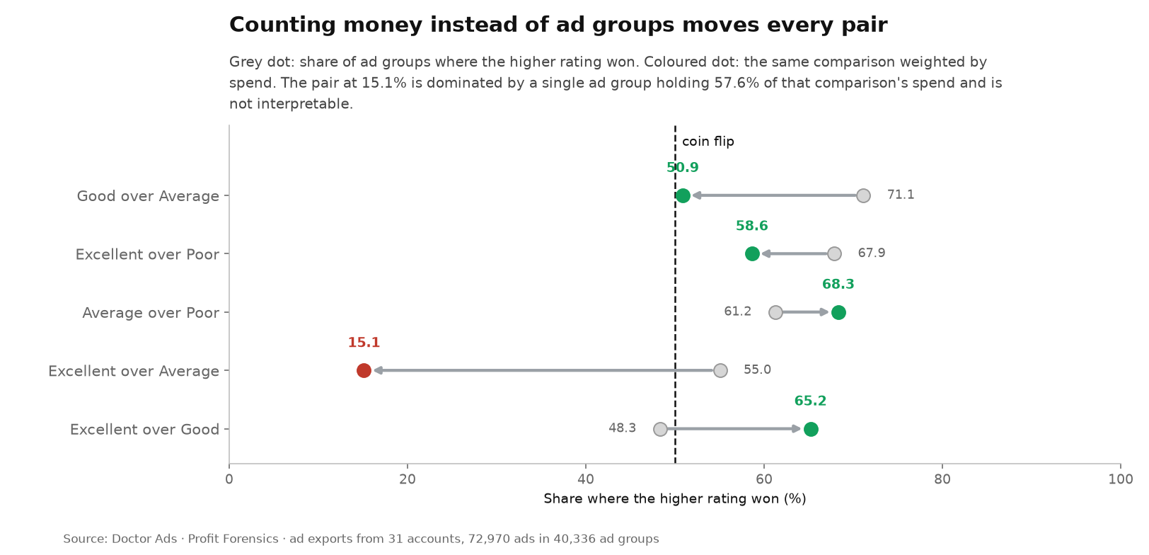
Every group above counts once, whether it spent little or a lot, and weighting by spend asks a different question: where the money went, did the higher rating win? The contract for this study registered both, so both are here.
| Comparison | Counting groups | Weighted by spend | Largest single group’s share of the pair’s spend |
|---|---|---|---|
| Good over Average | 71.1% | 50.9% | 36.8% |
| Excellent over Poor | 67.9% | 58.6% | 11.8% |
| Average over Poor | 61.2% | 68.3% | 5.2% |
| Excellent over Average | 55.0% | 15.1% | 57.6% |
| Excellent over Good | 48.3% | 65.2% | 3.8% |
Two things follow, and neither is convenient.
The 15.1% is not a finding. In the Excellent against Average pair a single ad group holds 57.6% of all the spend in the comparison, and the top three hold 70.3%. A spend-weighted share built on one group is that group’s opinion, not the portfolio’s. We report it because the study registered the weighting, and we decline to interpret it.
The last step does not get cleaner under weighting, it gets contradictory. There the money is spread out, the largest group holds 3.8%, and the weighted answer disagrees with the group-counted one: 65.2% against 48.3%. In the groups where more budget sat, the Excellent ad was the better-clicked one more often than not. Read that number carefully though: it is the share of the pair’s spend sitting in groups where the higher rating won, not a frequency of wins, and a handful of large groups can carry it.
So the honest reading of the last step is “unstable”, not “wrong”. Counted by group it is a coin; counted by money it leans the other way; and the two counts do not agree.
Two more ways to break the result, both checked
One dominant ad per group. If a group serves almost all its impressions to a single ad, its median CTR by rating is really one ad against a rounding error. Dropping every group where one ad takes more than 80% of impressions leaves the picture recognisable: Good over Average 73.4%, Excellent over Poor 58.9%, Excellent over Average 54.3%, and the last step at 50.7%.
One account carrying it. Removing each of the accounts with usable mixed groups in turn keeps Good over Average between 63.2% and 74.7%, Excellent over Poor between 62.2% and 80.2%, Excellent over Average between 53.0% and 61.0%, and the last step between 46.1% and 54.5%. No single account holds any of it up, and the last step stays pinned to the coin line from both sides.
What to do with the rating on Monday
Treat the scale as informative until the last step, and stop there.
If an ad reads “Poor” or “Average”, the rating is telling you something real, usually that you have too few assets or that they repeat each other, and the ads that clear that gap are the better-clicked ones in roughly seven cases out of ten. That is a genuine use, and it is stronger than the “ignore Ad Strength” advice that circulates.
Once an ad reads “Good”, the evidence for the last step runs out: counted by group it vanishes, counted by spend it reappears, and the two disagree by seventeen points. Nothing here can tell you which way it will go for your account, so the tenth near-identical headline is not where your next hour belongs. Fix the floor, then go and argue with your offer.
The deeper habit worth breaking, and practitioners argue about it constantly, is treating a platform score as a ranking of things it never observed. It is the same reflex we measured one level up, where optimization score fails to rank campaigns inside a single account, and the same reflex behind assuming a match type behaves the way its name suggests, which broad match does not.
The researcher’s take
The useful part of this is not that a Google metric disappoints. It is where it disappoints. Getting an ad out of “Average” is real work with a real payoff in how it gets clicked, and I would not talk a client out of it. Getting from “Good” to “Excellent” is asset bookkeeping, and the data cannot tell you it buys anything. Fix the floor, then go and argue with your offer, which is the part of the ad the auction actually prices.
Method and sources
Doctor Ads Profit Forensics is the research desk of a Google Ads practice with 19 years and $770M managed spend behind it.
Data statement (corpus version 2026.07). Google Ads ad-level exports from 31 accounts in the Doctor Ads managed portfolio, one physical export per account. Ads qualify with at least 100 impressions and one of the four working ratings; the placeholder values Google returns for non-applicable ad types are excluded. That leaves 72,970 ads across 40,336 ad groups. Of those ads, 58,284 report a click-through rate; the remaining 14,686, all from four accounts, report none and are excluded rather than counted as zero. That reduces 6,247 mixed-rating groups to 3,704 with two usable ratings, of which 3,604 enter at least one published pair, across 24 accounts. Rating mix among qualifying ads: Average 25,244, Excellent 23,616, Good 20,631, Poor 3,479.
Selection note. A managed portfolio skewed toward larger spend, e-commerce and subscription businesses, not a random sample of advertisers. The evidence is also concentrated by surface: 92.5% of the usable mixed-rating groups are search campaigns and 6.3% are Demand Gen, so this is a search result first.
Measure. Inside each ad group, the ordinary median click-through rate of each rating present, compared pairwise; a group counts as a win when the higher-rated median exceeds the lower-rated one, with equal medians counted as ties and reported. Three pairs were registered before the query ran: Excellent against Average, Excellent against Poor, and Good against Average. Excellent against Good and Average against Poor were added afterwards and are labelled exploratory in the table. Robustness: full leave-one-account-out across the 24 accounts with usable mixed groups, spend weighting alongside group counting, and a registered counter-hypothesis on group composition tested by excluding groups where one ad takes more than 80% of impressions. The 100-impression floor and the kill condition, a 75% win share for the higher rating, were fixed in writing before the query ran.
Reconstruction. Export ads with rating, impressions and CTR for one export per account. Keep ads at 100 impressions or more with a reported CTR. Group by account, campaign and ad group; keep groups with at least two ratings present; compare medians pairwise; report win shares with group and account counts.
Changelog. First publication, 2026-08-10. Sources: Adalysis on Ad Strength within ad groups, Optmyzr’s Ad Strength and creative study, Optmyzr’s 2026 RSA performance study, Search Engine Land on Ad Strength and RSA success.
Limitations
- Click-through rate only. Conversions are not compared. Account-local conversion comparisons inside ad groups are possible and simply were not part of this pass.
- Association, not effect. Ads are compared as they ran, not before and after a change. Nothing here estimates what improving a rating does.
- Same window, not proven simultaneous. One export shows a reporting window, not a serving timeline: two ads in a group could have run in sequence rather than side by side.
- The last step is exploratory. Excellent against Good was not registered before the query and carries the article’s most quoted number. It replicates a published result, which is reassuring, but it is not a confirmatory test.
- Weighting disagreement is unresolved. Group-counted and spend-weighted shares differ by up to seventeen points at the last step, and in one pair the weighted figure is uninterpretable because a single group holds 57.6% of the spend.
- Uneven pair sizes. Excellent against Poor rests on 224 groups in 11 accounts against 1,613 groups behind the last step.
- The design is not new. Adalysis published the within-ad-group comparison in 2022 on a far larger sample. What is new here is the split by step and the composition breakdown.
- Managed portfolio, search-heavy. Larger accounts, self-selected, skewed by vertical and surface.
Key takeaways
- Inside the same ad group, “Good” beats “Average” on click-through rate in 71.1% of cases, “Excellent” beats “Poor” in 67.9%, and “Excellent” beats “Average” in 55.0%. The scale carries information.
- Between the top two steps it does not: “Excellent” beats “Good” in 48.3% of 1,613 groups, which reproduces Adalysis 2022 on an independent corpus. That pair is exploratory, not registered.
- Spend weighting moves several pairs and reverses the last step to 65.2%; in one pair it is uninterpretable because a single ad group holds 57.6% of the spend.
- Cross-account rating comparisons are unusable: ads rated “Poor” show a higher median CTR than “Excellent” ones purely as an artefact of surface mix.
- Use the rating to escape “Poor” and “Average”. Do not spend your Monday on the last step.
When this does not apply
If your ad groups run a single ad each, there is nothing to compare and the rating is your only feedback on asset completeness. Launching a new ad group with no history, clearing the checklist is a reasonable default. And if your account is Demand Gen heavy, note where this evidence comes from: 92.5% of the usable mixed-rating groups are search campaigns, against 6.3% Demand Gen.


