

TL;DR abstract. This is not the hidden search terms story you have already read. Seer Interactive, Adthena and others measured the search terms report, where Google withholds individual query strings for privacy and where estimates of hidden spend run from roughly a quarter to about half. This page measures something else: the leftover row inside the search terms insights report, the one Google labels “other search terms” and fills with, in its own words, terms “that have lower spend or don’t have an identifiable search category”. Different report, different unit, and as far as we can find, nobody has published a multi-account share for it.
Across the managed portfolio carrying 6.6 million clicks, that leftover row holds a median of 44.0% of the clicks the category report accounts for, with the middle half of accounts between 26.0% and 78.4%. Pooled across all accounts it is 29.9%, and the gap between those two numbers is the documented low-spend threshold doing its job. At the median it is the largest single row in the report, and the named categories still hold the majority at 56.0%. The report covers Search, Performance Max and Shopping together, and this snapshot cannot split the leftover share by campaign type.
You open the category report to find out what people typed. Its biggest single row is the one that names nothing.
One point of confusion is worth clearing before the numbers, because the row has two faces. In the Google Ads interface it appears with a label, “other search terms”. In the data feed behind that interface the category field comes back empty, which is exactly how we identify it. Both are the same row, and the label describes where something was filed rather than what it was about. That is the whole problem with it: a category tells you an intent, and this one tells you only that Google had nothing to say.
The report itself is a genuine improvement on what came before, and for automated campaign types it is often the only window there is, which is why Performance Max has to be judged on what it returns rather than on what it shows. Google builds it by grouping search terms by intent, and, importantly, those groupings “take all search terms into account, including those not exposed in the search terms report due to privacy reasons”. So it sees more than that report does. The catch is where the leftovers go.
One leftover row, in every account
We pulled every category row in the managed portfolio: 42,535 rows, 6,604,622 clicks, from January 2025 to the snapshot date. Exactly one row per account arrives with the category field empty. Not a few rows, not a scattering. One, in every account.
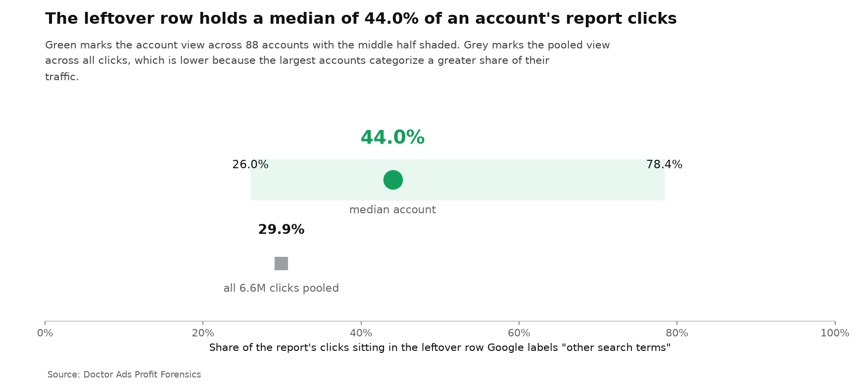
In the median account that row carries 44.0% of the clicks the report accounts for, which makes it the largest single row while the named categories together still hold the other 56.0%. The middle half of accounts sits between 26.0% and 78.4%, so in the top quarter that one row genuinely is most of the report. Remove any single account and the median moves only between 42.43% and 44.32%.
Pooled across all 6.6 million clicks together, 29.9% land in the leftover row. Both numbers are true and the gap between them is mechanical rather than sinister: Google files lower-spend terms into this row on purpose, so an account with more terms above that unpublished threshold gets more of its traffic named. Bigger accounts are not being treated better. They simply have fewer terms below the line.
The named categories are not the answer either
The obvious response is to work with the categories you do get. The median account gets 123.5 of them, which sounds like plenty until you look at the shape.
In the median account, 47.4% of its named category rows carry fewer than ten clicks each, with the middle half of accounts between 33.8% and 64.7%. Across the whole snapshot those sub-ten-click rows hold just 1.6% of all named clicks. Nearly half the rows in a typical report are dust: they fill the screen, they cannot support a decision, and they make the report feel more informative than it is.
So the working picture for the median account is one large leftover block, a modest number of categories with enough traffic to mean anything, and a long tail of rows that exist only to be scrolled past.
The streetlight effect, in a Google report
There is an old joke about a man searching for his keys under a streetlight, not because he dropped them there, but because that is where the light is. The category report is the streetlight. It is well lit and easy to read, and it invites you to build your optimization around the part of your traffic Google was able to name.
The Other Bucket is the rest of the pavement. It is not hiding anything sinister, and at the median it is not even most of the traffic. It is one row that is larger than any named category and, by construction, tells you nothing about what is inside it. An owner who treats the named list as the map is working from 56% of the report in a typical account, and from a fifth of it in the worst quarter.
What to do with it
- Read your own share and compare it with this portfolio. Sort the report by clicks and find the row labelled “other search terms”. Median 44.0%, middle half 26.0% to 78.4%. There is no validated cut-off between a useful report and a useless one, so use the distribution rather than a made-up threshold. Above your own median, treat the named categories as a sample rather than a map.
- Do not treat category counts as coverage. A hundred rows where nearly half carry under ten clicks do not add up to a hundred insights.
- Keep the ordinary search terms report for Search campaigns. It shows fewer terms, but the ones it shows are individually actionable, and that is where the concentrated waste turns up.
- For the part you cannot see, use the three levers that survive invisibility. Read the leftover row’s own conversions and conversion rate against your named categories, mine n-grams on the visible search terms for your Search campaigns, and treat named categories as hypotheses to test rather than as negative keyword lists. Note the ceiling on that first move: the report carries clicks, impressions, click-through rate, conversions, conversion rate and conversion value, but no cost, so you cannot work out what the leftover row cost you. Google now also publishes a search terms report for Performance Max, which is worth opening for the same reason.
The researcher’s take
I am not going to call this hiding, because Google documents the row, names the rule that fills it and tells you the grouping covers terms the other report will not show at all. What I will say is that the report gets read as a map, and in the median account the biggest thing on the map is an unlabelled block covering 44.0% of the ground. The right reaction is calibration rather than outrage. Know your own share, stop grading automated campaign types on how much they show you, and grade them on what comes back instead. And if you came here from the older hidden-search-terms studies, keep the two apart: that argument is about query strings being withheld, this one is about a threshold inside a different report.
Method and data statement
Doctor Ads Profit Forensics is the research desk of a Google Ads practice with 19 years and $770M managed spend behind it.
Source: one snapshot of an agency management account, exported through a read-only API window on July 10, 2026, covering the search terms insights resource from January 1, 2025 to the export date. Accounts are pseudonymous, and no category label appears anywhere in this article, because those labels are live customer search strings. The population is 42,535 category rows across 88 accounts, 6,604,622 clicks and 217,136,633 impressions. The leftover row is identified by a blank category label in the API, which the interface displays as “other search terms”, and appears exactly once per account in all 88; we treat it as the documented account-level “other search terms” row and did not separately measure the subcategory-level “uncategorized search terms” that Google also describes. Per-account shares were calculated inside each account and summarized as a median with the middle half reported; the pooled share is every leftover-row click in all 88 accounts divided by all 6.6 million clicks. The per-account median was recalculated 88 times with one account omitted each time and stayed between 42.43% and 44.32%. The small-category figures use a ten-click threshold that is ours rather than Google’s: the per-account share is a median across the 74 accounts with at least five named categories, while the 1.6% of named clicks is a corpus figure across all named rows. This snapshot is a different population from the $133M corpus used in our other studies.
Limitations
- A different report from the hidden search terms studies. Published estimates of withheld spend concern the search terms report, where Google suppresses individual query strings. This measures the leftover row of the category report and is not comparable to them.
- Coverage of a report, not quality of traffic. A click in the leftover row is not a worse click. It is a click Google did not put in a named category.
- The report carries no cost column. Clicks, impressions, click-through rate, conversions, conversion rate and conversion value are there; spend per category is not. That limits what can be decided from the leftover row even when you read it carefully.
- Three campaign types mixed. The report is account-level and covers Search, Performance Max and Shopping together. This snapshot cannot split the leftover share by campaign type, so a Performance Max advertiser cannot read their own figure off this page.
- One window. Category coverage can shift as Google changes its grouping, and this is a single snapshot from January 2025 onward.
- Managed portfolio. Professionally managed accounts skew larger than average, and larger accounts have more terms above the naming threshold, so the median share of 44.0% may understate what a small advertiser sees.
- Impression-side questions are separate. For Search campaigns the missing-impressions question is measured here.
Key Takeaways
- The median account keeps 44.0% of its report clicks in one leftover row, the largest single row there. Named categories together still hold 56.0%.
- Pooled across 6.6 million clicks the share is 29.9%. The gap is Google’s low-spend threshold, not a quality gap in the classifier.
- All 88 accounts have the row. It is a structural part of the report, not an anomaly.
- In the median account 47.4% of named categories hold under ten clicks. Row count is not coverage.
- This is not the hidden search terms story. That one is about withheld query strings in a different report; this is a threshold inside the category report.
When this does not apply
Very large single-market accounts. Where traffic concentrates on a few well-known intents, most terms clear the naming threshold and the report genuinely does most of the job.
Brand-dominated accounts. When most searches contain the brand name, Google names them easily, and coverage looks better than the underlying diversity of the account.
This analysis describes observed portfolio data and does not guarantee the same result in another account.


