

TL;DR abstract. Which account check should an owner run first, and what does the evidence behind each one actually say? This page orders eight checks by the strength of the measurement supporting them. The evidence comes from a managed portfolio of Google Ads accounts measured across export windows that mostly run from September 2024 into January 2025.
The strongest single signal is concentration: across the managed portfolio the worst tenth of zero-conversion search terms holds a median 48.8% of the spend in that pool, so the first hour of an audit belongs there rather than at the top of the interface. Two checks appear at the end as work to stop doing, because the platform scores underneath them did not rank outcomes inside an account. Rows use different denominators, and none of them is a forecast of what a specific account will recover.
48.8% of the median account's zero-conversion search-term spend sits in its worst tenth of terms. A Google Ads audit is simply a structured search for money the account spends without getting the intended result. That concentration means your first hour should not follow the order of the interface. It should follow the money.
This checklist is ranked by the strength of the evidence behind each check, not by a single dollar figure. Direct spend pools come first, large measured gaps across many accounts come next, and diagnostic clues come last. The measures use different units and different denominators, so no row is comparable to another as an amount, and none of them is a forecast of what you will recover. It is The Recovery Order: the sequence in which evidence says an owner should open each case.
| Rank | Audit check | Measured money signal | Sample |
|---|---|---|---|
| 1 | Concentrated zero-conversion terms | 48.8% of zero-conversion spend in the worst tenth of terms | managed portfolio |
| 2 | Total zero-conversion term pool | 29.0% of paid search spend | managed portfolio |
| 3 | Performance Max target overshoot | 71.3% missed the promised price by more than 10% | 178 campaigns |
| 4 | Target delivery across campaigns | 26.8% landed within 10% of target | 2,723 campaigns |
| 5 | Weak hours | 51.0% of spend ran below the account's daily click-rate baseline | managed portfolio |
| 6 | Hidden auction rivals | 46.3% of overlap came from rivals without a numeric share | managed portfolio |
| 7 | Broad versus exact economics | 6.4% higher median cost per conversion on broad | managed portfolio |
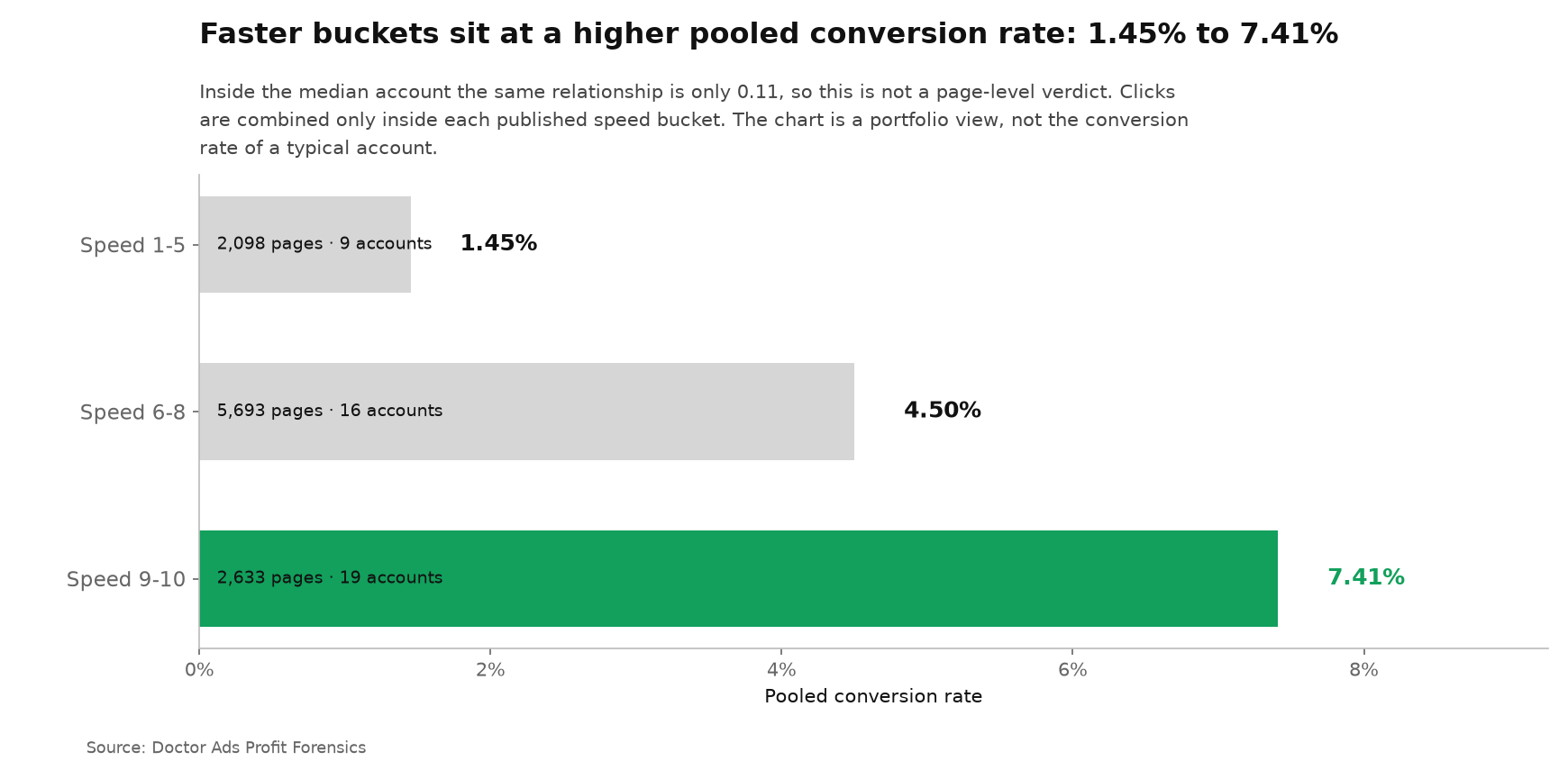
| 8 | Mobile landing-page speed | 7.41% versus 1.45% pooled, median within-account rank relationship 0.11 | 2,633 and 2,098 pages |
1. The worst tenth of search terms holds 48.8% of the waste
Start with the search-term report, but do not scroll it alphabetically. Across the managed portfolio, the worst 10% of zero-conversion terms held a median 48.8% of all spend in that zero-conversion pool. That concentrates the first review into a fraction of the rows.
The median short list still contained 13,806 terms out of 138,066 zero-conversion terms per account, so it is not a hand-editing task. Sort by spend, group repeated themes, and inspect the expensive clusters first. The full concentration analysis is in our search-term waste study.
2. Zero-conversion terms absorb 29.0% of paid search spend
After isolating the concentrated head, size the whole pool. The median of those same accounts placed 29.0% of paid search spend into terms that recorded no conversion in the export window. That is the direct budget at risk, not a score or a proxy.
A zero in one window is not a permanent verdict on a term. The action is to separate a new term with too little evidence from an expensive term that has already had enough chances. This definition and its boundaries are documented in the same source analysis.
3. Performance Max overshot its target in 71.3% of measured campaigns
The next check is the price per sale you promised the algorithm against the price it actually delivered. Performance Max exceeded that target by more than 10% in 71.3% of 178 campaigns. Search did so in 26.3% of 1,563 campaigns. The gap tells you where target drift deserves attention first.
This is a descriptive split, not proof that campaign type created the miss. Use it to order the investigation: verify conversion inputs, target realism and campaign mix before asking the algorithm for more volume. See the measured comparison in our target-delivery study.
4. Only 26.8% of targeted campaigns landed within 10% of the promise
Do not stop after the campaign-type split. Across 2,723 campaigns in the managed portfolio, only 26.8% delivered within 10% of their explicit target, and 47.4% landed within 20%. The label can say the campaign has a target while the economics say the target is not being met.
The audit move is to calculate delivered cost against promised cost campaign by campaign, then sort by spend exposed to the gap. The exact population and inclusion rules are in the same target-delivery study.
5. Weak hours carry 51.0% of the median account's spend
Time comes after direct waste and target delivery because click weakness is a clue, not a sale. Across the portfolio accounts where the hourly baseline can be calculated, the median account ran 51.0% of its spend in hours when its own click rate sat below its daily average. That is too much money to leave hidden inside a daily total.
An hour below the click baseline is not automatically an hour to switch off. Compare its conversion value and volume next. The point of the check is to expose when money runs differently, as shown in our dayparting study.
6. Unnumbered rivals hold 46.3% of auction overlap
The auction report hides many small rivals behind a less-than sign instead of a share number. Across the managed portfolio, those unnumbered rivals represented a median 46.3% of total auction overlap. Ignoring them can erase nearly half of the competitive encounters visible in the report.
Overlap is not market share, and this check does not assign revenue to a rival. It does tell you whether the named top competitors are the whole pressure set or only its visible head. The reconstruction method is in our Auction Insights analysis.
7. Broad match costs 6.4% more per conversion in the median account
Match type comes lower because the measured gap is smaller than the spend pools above. Across the managed portfolio, the median account paid 6.4% more per conversion on broad match than on exact match. That difference is still large enough to inspect where a broad query theme is absorbing scale without matching its economics.
Broad match was not assigned randomly, so the number does not say a switch to exact will recover 6.4%. It says to compare the two inside your account before accepting the label as a performance strategy. The measured result is in our match-type analysis.
8. Fast pages show a fivefold pooled gap and a weak local link
Pages scoring 9 or 10 on Google's mobile speed scale converted pooled clicks at 7.41%, against 1.45% for pages scoring 5 or below. The buckets contain 2,633 and 2,098 pages from the managed portfolio. That makes speed worth opening as an audit case.
It ranks last because the inside-account relationship is weak: the median rank relationship is 0.11 across the qualifying portfolio accounts, with the middle half from -0.06 to 0.21. Verify the pattern locally before paying for a rebuild. The full result and method are in our native-score study, alongside Google's landing-page guidance.
A conducted account examination can apply this sequence to your own data. A Profit Forensics examination starts with the same question: which measured pool carries the strongest evidence of exposed spend, and in what order to open it.
Stop checking scores that do not rank the outcome
A complete audit also removes work that only creates the appearance of control. Two common checks belong in that category once the underlying floor is healthy.
| Stop doing | Measured reason | What to do instead |
|---|---|---|
| Sorting campaign work by Optimization Score | Median rank relationship with click rate was 0.05 across qualifying portfolio accounts; with conversion rate, -0.05 across the accounts qualifying for that measure | Sort spend, zero-conversion cost and delivered cost against the campaign's own target |
| Polishing Good ads until they become Excellent | Excellent beat Good in 48.3% of 1,613 matched ad groups across the managed portfolio, an exploratory pair that was not pre-registered | Repair Poor and Average ads, then let observed outcomes rank Good and Excellent |
Google describes Optimization Score as an estimate shaped by recommendations. Our within-account test found a median relationship of 0.05 with click rate across qualifying portfolio accounts and -0.05 with conversion rate across the accounts qualifying for that measure. That does not order campaign money.
Google describes Ad Strength as feedback on the assets supplied to an ad. In our paired replication of the Adalysis design, Good beat Average in 71.1% of 807 groups, but Excellent beat Good in 48.3% of 1,613, a comparison we ran as exploratory rather than pre-registered. The source study supports fixing the floor and abandoning the final polish.
Quality Score is absent from both lists. Its columns existed in only 3.3% of account exports, so the portfolio test was not run. The official Quality Score guidance is not a substitute for missing account data, and one account is not a portfolio conclusion.
How to run The Recovery Order
- Export one consistent reporting window and preserve spend, clicks, conversions and the relevant native fields.
- Start with direct spend exposed to no conversion, then calculate target delivery.
- Move to timing, auction pressure and match-type economics.
- Use speed and platform scores only to open a case. Rank the case with outcomes inside the same account.
Audit in the order the evidence is strongest, not the order the interface is arranged. That is The Recovery Order in one sentence.
The researcher's take
I distrust audit checklists that mirror the navigation menu. They make every setting look equally important and turn a commercial diagnosis into housekeeping. I want the first hour to expose the largest direct spend pool, the next hour to test whether the account is keeping its own price promises, and only then to inspect useful proxies. A clean score can wait. Money that is already leaving the account cannot.
Igor Ivitskiy, PhD
Method and boundaries
Doctor Ads Profit Forensics is the research desk of a Google Ads practice with 19 years and $770M managed spend behind it.
The figures are previously published atoms from Doctor Ads Profit Forensics, corpus version 2026.07, measured on one selected export window per account. The portfolio is managed, self-selected and tilted toward larger accounts. Search-term waste means spend on terms with no recorded conversion in that window, not a permanent judgment on a query.
Click-rate weakness is a diagnostic flag, not a sales loss. Match type, campaign type and page speed were observed as they ran. Their measured differences may not repeat after a setting change. Sample sizes are attached to every ranked item so a large percentage from a narrow slice cannot masquerade as a portfolio rule.
This checklist describes observed account patterns and is not a guarantee of savings or performance.
When this does not apply
Broken conversion tracking. If the account records the wrong actions or misses sales, every money ranking inherits the error. Repair collection before interpreting zero-conversion spend or target delivery.
New or sparse accounts. A short window can label a promising term as waste before it has enough clicks to prove anything. Extend the window or use a controlled setup review until outcome data can carry the order.
Accounts unlike this portfolio. These checks were measured on a managed portfolio that skews to larger accounts. A small or newly built account can behave differently, so rerun the numbers on your own data before acting on the order.


